- I'm liking, second from the left on the bottom row. I just think the spiky bits on the silhouette look interesting
- I like second from the right on the bottom row also. It looks very plain so could be elaborated upon, but it looks like it has maneuverability in the design.
- I like the headdress on the top row. The shape is quite strong.
- I don't think the two on the top row closest to the left work at all. The first just looks clunky and the second too top heavy.
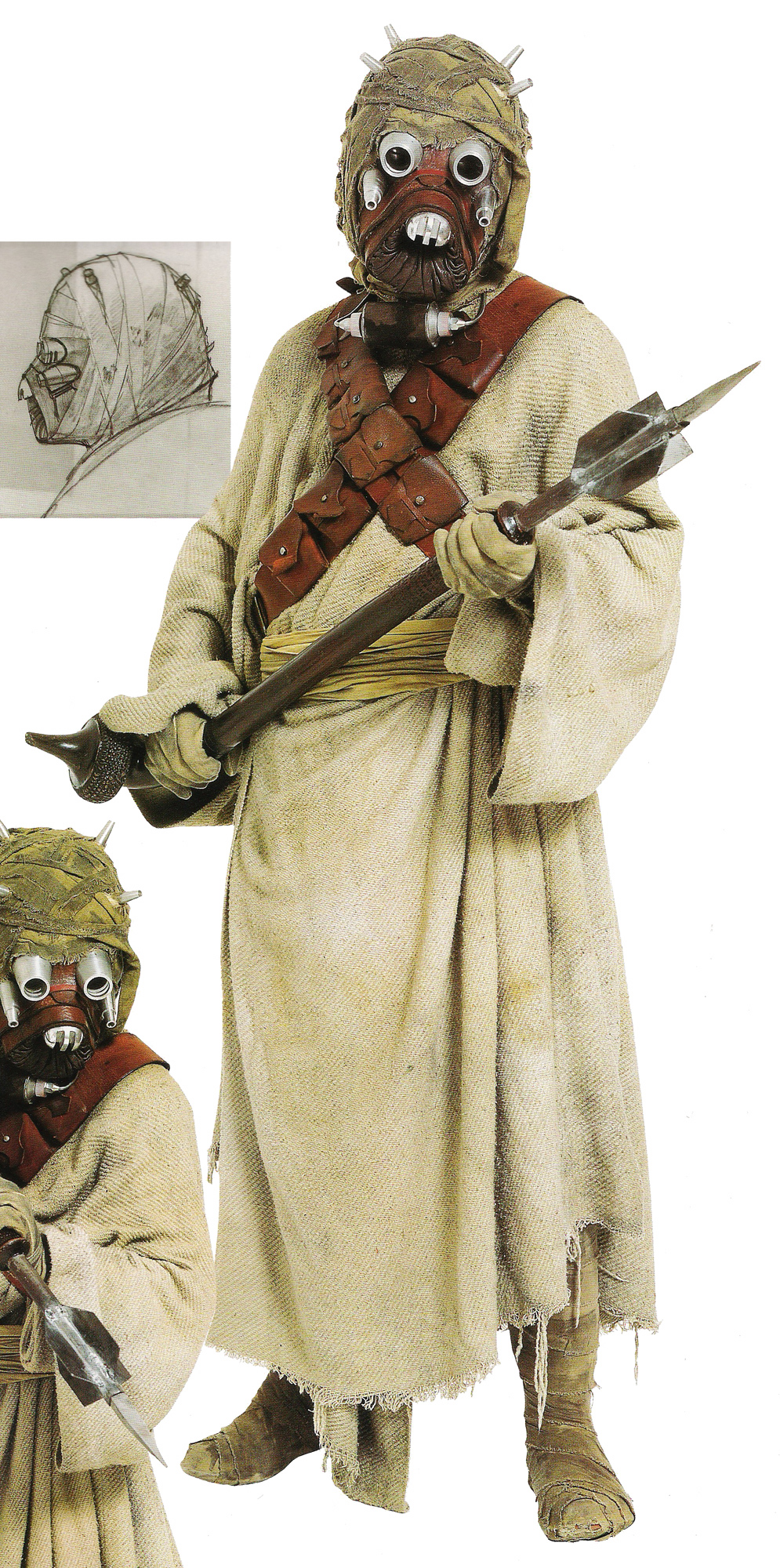
- The same goes for the design far left on the bottom row. It looks liek it has needles sticking out of its head or something. It looks like a cross between an emissary from Dragon Age Inquisition and a Tusken Raider.
Thursday, 15 October 2015
Media Tests | Sheet Two | Silhouettes
Subscribe to:
Post Comments (Atom)


0 comments:
Post a Comment