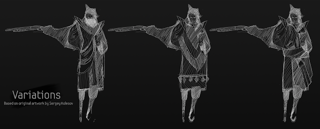
So, this art test caused a lot of stress,
The objective was to interpret the provided character sketch (by Sergey Kolesov) as a functional character suitable for a stylish action game.
The main struggle here I think, was the deadline. I don't usually struggle with deadlines but this one was tight, and it taught me a lot.
So, Got the brief Monday afternoon/night and it was to be submitted for Friday 2pm. I was busy all day Thursday and Friday due to prior arrangement and had a lot of catch up work to do for week 7 (my own fault I know) But that gave me only intervals of time between other things to work on this.
Now, I know we were told not to do this art test if we needed to catch up on work but obviously, like always, I decided to pile things on myself. I thought even if I only have a small amount of time, some feedback is better than no feedback so even if this wasn't going to be my best work, it was still an opportunity for crit.
This is starting to sound like an excuse so I'll just start talking about why time caused a problem and how I dealt
Because of all this, I just slung what looked remotely similar onto one page and did the variations very last minute. Then, in an attempt to stylize it in some way inverted the drawing. I know it was a bad idea, you don't have to tell me. I just didn't have time to fix it, and like I said, I wanted to submit something.
So yea, in the crit, I learnt that the white lineart on the black background made the design hard to read, which I knew, and that this was bad, which I again, knew. As a designer you arent supposed to hide your actual designs behind a really bad style choice, which is what I did.
Luckily, I learnt in future to plan out something like this in advance if I ever have to do it again, and to,
EDIT: Also, I removed the sandwich, why did I do that, I think it made the character interesting.


0 comments:
Post a Comment