I wanted to continue on with the Character Art tests. I hadn't had much time to complete the art tests because of catch up I'd left myself for week 7 and "the event" rehearsal, and event itself my group and I promised Dayna that we would attend.
Nevertheless I thought feedback on something that wasn't my best standard would be better than no feedback at all so I did it anyway in the time I had.
I decided after the lecture today to come back to the character test and do some redesigns as I was not happy with the one I submitted. Subconsciously I think I started to merge the character test with my own CAP project inspiration of China/Tibet/Mongolia ect. and I think it's come up with something pretty interesting that I might take forward.
When I thought about the redesign, I wanted to create more of an action pose. In the art test I used the same pose as the reference material but I don't think that pose showed the design I had in my head off very well. Here is a redone version and the running blades I wanted on the feet are a lot more obvious (and shown off) here.
Having the design in colour also helps bring a spark of life to the drawing. Lots of artists such as Anthony Jones work almost solely in value - and they do it very well but I feel like adding colour makes an image instantly more energetic.
Going straight into colour however, I didn't take the time to think about values on this design and I should have done. The light source in the image is all over the place. (highlighted in issue two on the drawing above). This stops the image from having a focal point or a sense of depth.
Another issue is the pauldrons on the shoulders. They're poising different angles and they shouldn't be. I mean, I could always say it was a stylistic choice, and it might have been subconsciously as I was drawing but I don't remember. I just know that when I look at it I think it looks a bit weird, and that the one on the left should be at the same angle as the one on the right.
Initially I wanted to redo the character sheet and I started fussing with all the problems in the image before I realised that may not be the best direction to go. What I want to do, my goal, is instead
to move in from this, stop fussing over it and actually combine this design with some of my silhouette deisgns to see what I come up with to further the development of my brief.
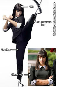
Based on Gazelle pose from Kingsman as her pose showed off prosetic legs/feet really well.


0 comments:
Post a Comment